The graph above (Veron, 2008) illustrates the growth of large reefs and their relationships to extinction events. If you add on the current extinction event to the far right side of the graph, I think it will be plainly obvious that reefs are the cause of mass extinction. What? No? How could that be??? Well, it's not. And that is not what the paper was trying to say, but that is how it looks upon first viewing of the graph (at least, to me). The point of the paper was to show that reefs are good places to study mass extinctions because they build up then dissapear across an extinction event. But, again, that is not how it looks to me as I scan across the article.
And this is the problem with science. Both as people doing the science and those reading the science. Sometimes, your first impression is wrong. Step back. Reanalyse what you are seeing, and try to think what else it could be. Sometimes the obvious answer is the correct one. Sometimes it isn't.
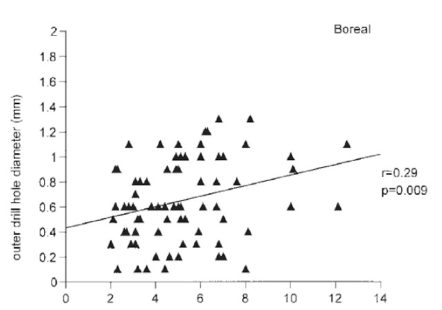
Another case is that of people misreading data. This is from the perspective of someone reading the paper but I think the writers missed something. The below graph (Hoffmeister and Kowalewski, 2001) is my case in point:

The authors stated this about the graph (as well as some other associated graphs):
"Spearman rank correlation shows a significant positive correlation in ..." (emphasis added by me)Now , I don't know about you but I don't see significant, I don't even really see positive, I see a whole lot of random dots with a line that shouldn't have been place through the data. This is my point. Sometimes there is no correlation. Step back. Look at the data with new eyes, what you see is not always what is there. Take your time.
Science is a slow process. It takes a lot of man hours to do even simple experiments. Don't mess it up by throwing bad or missinterpreted data out there, because that is all people are going to see. They aren't going to notice your 100's of hours in the lab or the countless field hours. They are going to see one bad dataset and assume the rest of the information is junk as well. Don't let that happen to you.
----------------------------------------------------
Hoffmeister, A.P., & Kowalewski, M., 2001, Spatial and Environmental Variation in the Fossil Record of Drilling Predation: A Case Study from the Miocene of Central Europe: Palaios, v. 16, p. 566-579.
Veron, J., 2008, Mass extinctions and ocean acidification: biological constraints on geological dilemmas: Coral Reefs, v. 27, p. 459-472.

Well, the purpose of statistics is to determine whether or not your eyes are fooling you. Often, data seem visually to have a pattern or relationship, but no statistical pattern or relationship really exists; conversely, data that appear visually random and unrelated actually may have a significant pattern or relationship. Assuming the authors did their statistics properly (and used appropriate statistical tests), the fact that you (or anyone else, including me) don't see what seems to you to be significant results in the graph is irrelevant. The graph summarizes the data; the text presumably discusses those data and their importance, as well as the details of the statistics run. The graph isn't inappropriate or misleading as long as it does what it's supposed to: show the distribution of data. That the graph doesn't make it clear that the data have a significant relationship or patten may be the fault of the authors (and reviewers and editors) for not using proper scales on the axes, but the data are what the data are, regardless, and just because it doesn't look like there's a pattern doesn't mean that there isn't a pattern--the statistics were performed in order to ascertain if there was a pattern.
ReplyDeleteGiven that it was Kowaleski involved, I'm willing to bet the statistics are sound from a mathematical standpoint. But there isn't enough discussion about a statistically significant trend and a biologically significant one.
ReplyDeleteI agree that data is just that, data. But their own test stated a Spearman rank correlation of 0.29 then proceeded to state that that was a significant positive correlation. By just having a r^2 of 0.29 means there is no correlation. So I'm not faulting the results, results are results. I faulting the interpretation of said results. If you put a line on a graph, have it mean something.
ReplyDeleteGranted, I may have taken this out of context but the graph should speak for itself. And it doesn't.